
Visual vs UX Design: what comes first?
First impressions matter. People tend to make quick judgements, it is no different in the case of digital products. The way your product looks affects the customers’ experience – how long do they stay on and explore it or will they return? Hence, visual aesthetics do matter. Let’s deep-dive into what visual design is, what principles should be followed for better user experiences and how it is related to usability.
When you hear of “Visual Design”, what is the first thought that pops up? Do you think of something aesthetically pleasing, flashy animations, or do you picture the countless vividly colored screens from inspiration sites, such as Dribbble?
The majority of people tend to associate Visual Design with simply beautifying digital applications, websites, or general interfaces, reducing its scope greatly. Although it does indeed possess this attribute, there is so much more to it than just making something visually appealing.
In this article, we will take a look at what Visual Design actually entails, what its role is within the universe of User Experience, and also dwell shortly on a few cores of its fundamentals.
Let’s first start with a simple definition:
Visual Design is the use of imagery, color, shapes, typography, and form to enhance usability and improve the user experience.
The keywords to pay attention to are “enhance usability” and “Improve user experience”.
Where is Visual Design in the universe of User Experience?
The main goal of visual design is to make the product usable, by drawing the attention of the users to the right functionality and information.
This is achieved by the implementation of text, colors, and images to enhance the overall user experience – this is the core concept of visual design and its place within UX.
Does that mean visual design is unimportant?
Before we answer this question, let's take a look at 2 examples below.
When viewing the two visuals please make a mental note of your first impressions and answer the questions listed below.
- Did you have a preference between the two visuals?
- Why did you prefer one over the other?
A certain impression, be it a good one or a bad one, was created simply by scrolling through a website, without interacting with it nor reading its content.
What does that mean? It means first impressions matter!
Many studies have been conducted to prove this point:
- It takes 50ms to form a design opinion
- Users strongly prefer websites that look simple and familiar. (Source)
- 94% of feedback on first look is all about design
- Bad UI was associated with mistrust and the credibility of the product by users. (Source)
- Visual appeal beats usability in the first impression
- Users gave low usability ratings to websites with low visual appeal and high usability ratings to sites with high visual appeal. (Source)
- Positive first impressions can lead to overall user satisfaction
- Users with a positive impression have a favorable opinion leading to user satisfaction. (Source)
So to answer our question of whether visual design is unimportant would be “No, it is very important when used right with the main goal in mind.”
If you want to attract your users from the first impression, you have to pay attention to how your product looks, not just how it works.
Principles of visual design
Let’s take a look at some attributes which we can recognize and understand how and why they are implemented.
(A great source to refer to for better understanding is ABNUX's Youtube video)
(Source)
Balance
is the distribution of the visual weight of objects, colors, texture, and space to create a stable feeling. In the example below
Emphasis
is a strategy that aims to draw the eye of the user to a specific element by creating a focal point in the design.
Hierarchy
The visual arrangement of elements to imply importance and convey the core message.
Repetition
The reuse of elements in the same or similar fashion throughout the design to create patterns. This creates predictability which makes users comfortable.
Proximity
The use of whitespace to manipulate design elements into either being grouped as similar or be separated. Whitespace is key to determining and communicating meaningfully using Proximity.
Proportion
The relationship between two or more elements in a design and how they compare to each other in a certain context.
Now that we have just learned these principles, the big looming question that comes to mind is,
Why are websites like Craigslist successful?
Websites such as Craigslist have notoriously and proudly been labeled as ugly websites that still work. So how are websites like this still around if visual design is important to retain users?
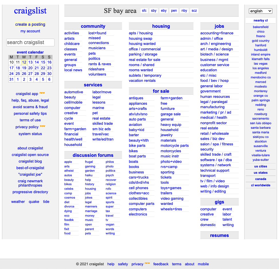
There are many reasons listed below as to why it works. Would you agree or can you think of a different reason?
- It feels “safe”
- It does a great job at dividing all the content into main categories and sub-categories, all of which are highlighted at the center of the page
- There are no distractions: no color, images, or backgrounds
- It’s easy to keep it consistent and to maintain it -> there are fewer chances for errors and bugs
In short, Usability and familiarity trump visual design.
Usability v/s Visual design: Aaron Walter’s Pyramid
The next question we must tackle is, how do we leverage this decision? How much time should we spend creating a visually appealing website v/s the time we must spend on making the product usable?
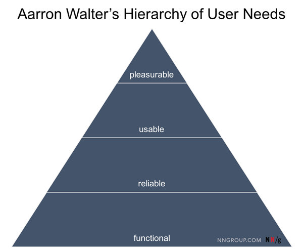
Take a look at the diagram of the pyramid by Aaron Walters. He suggests that once we have successfully made a product functional, reliable, and usable ONLY then does it make sense to spend further resources on making it pleasurable by improving the visual design.
A beautiful product that is not functional will not satisfy any user’s needs. It lacks purpose and no matter its aesthetic appeal, the product must first satisfy a need and be usable. On the other hand, if a product is functional but unreliable it will still leave the user unsatisfied.
In the example of Craigslist, the product is functional, it is reliable and usable. Those are the three main needs to be fulfilled before adding on the layer of delight (visual design) to the product.
So, beyond visual design what are we looking for in a decent website or application?
According to the Nielsen Norman Group, a consulting firm that is famous for its research in the user experience field, usability is defined by 5 components:
- Learnability
- Efficiency
- Memorability
- Affordances vs Errors
- Satisfaction
Learnability
considers how easy it is for users to accomplish a task the first time they encounter the interface and how many repetitions it takes for them to become efficient at that task.
In order to understand whether your application is learnable, you can ask questions like:
- What are the expectations of your users?
- Can you accomplish simple tasks the first time you use the website?
- Can you learn additional functionality as you go?
Efficiency
is the speed with which people do tasks after they have learned the interface.
- How many steps does it take to accomplish a certain goal?
- Can it be (and should it be) done in fewer steps?
- Which tasks have the highest priority?
Important note: efficiency ≠ number of clicks.
Many teams tend to measure the efficiency of digital tools by the number of clicks needed to complete the task. This is a dangerous approach that can lead to wrong decisions.
For example, clicks can be substituted by the hover functionality, which is not always intuitive and user-friendly. The number of clicks also depends not only on the design but also on the task complexity — so an absolute number, applicable for all tasks, will not tell you the truth.
Not all clicks are equal: some result in long wait times (if, for example, a new page is loaded) and others are instantaneous — for instance if an accordion is expanded.
Simply counting the number of steps in a process misses out on what users actually do, and the opportunities to provide them with a less frustrating experience.
Memorability
When users return to the design after a period of not using it, how easily can they re-establish proficiency?
- Do your users need help after not using an app after some time?
- Are there any recurring errors that your users do after a period of not using the app?
Affordances vs Errors
A design affordance is a clue about how an object should be used, typically provided by the object itself or its context.
- Can you tell the interactive and static elements apart?
- Does the outcome match the expectations of the user (e.g. when you click on the search field)?
- Does the hierarchy of the elements make sense?
- How many errors are there?
False affordances
False affordance is one where the user expects one thing, and something else happens. In the digital world, this would include things like:
- A button that looks active but does nothing when clicked
- A logo that isn’t linked to anything
- The words ‘click here’ when the text is not a link
- A red button associated with positive action, or a green button associated with a destructive action
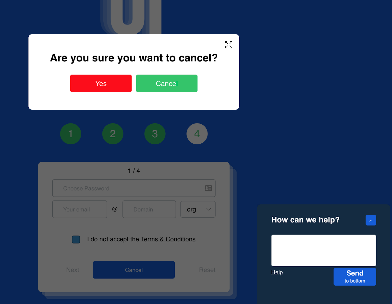
https://userinyerface.com/ is a great example of false affordances. Try it yourself!
Conclusion
If you’re considering an expensive redesign, first consider the usability of your application or website. If your website is highly functional, and is already being used, a fancy redesign has the potential to tank your profits and site growth.